LAPGEAR® Case Study
I led the creative direction for LapGear®, refreshing its branding to make a stronger impact online and in stores. This included redesigning packaging, refining the eCommerce experience, and creating engaging social content. The website relaunch drove immediate results, boosting conversions and sales.
Role:
Art Director, UX Designer, Social Content Creator
Project Goal:
Create a strong and consistent visual representation of the brand across the web and in retail stores.
Key Challenges:
Making updates that weren’t too drastic and costly to keep retailers happy with the upcoming changes.
LapGear®:
A Case Study
LapGear® is a US-based company that has been in business for over 40 years. Starting with a handful of patented products, LapGear® has grown to have over 50 different items with that number still growing due to demand.
With the transition from office to remote/hybrid work, lap desk has seen a category growth of over 300% since 2019. This has attracted many new sellers who are looking for a way to make a dollar, leading to poor quality products with horrible to no customer service.
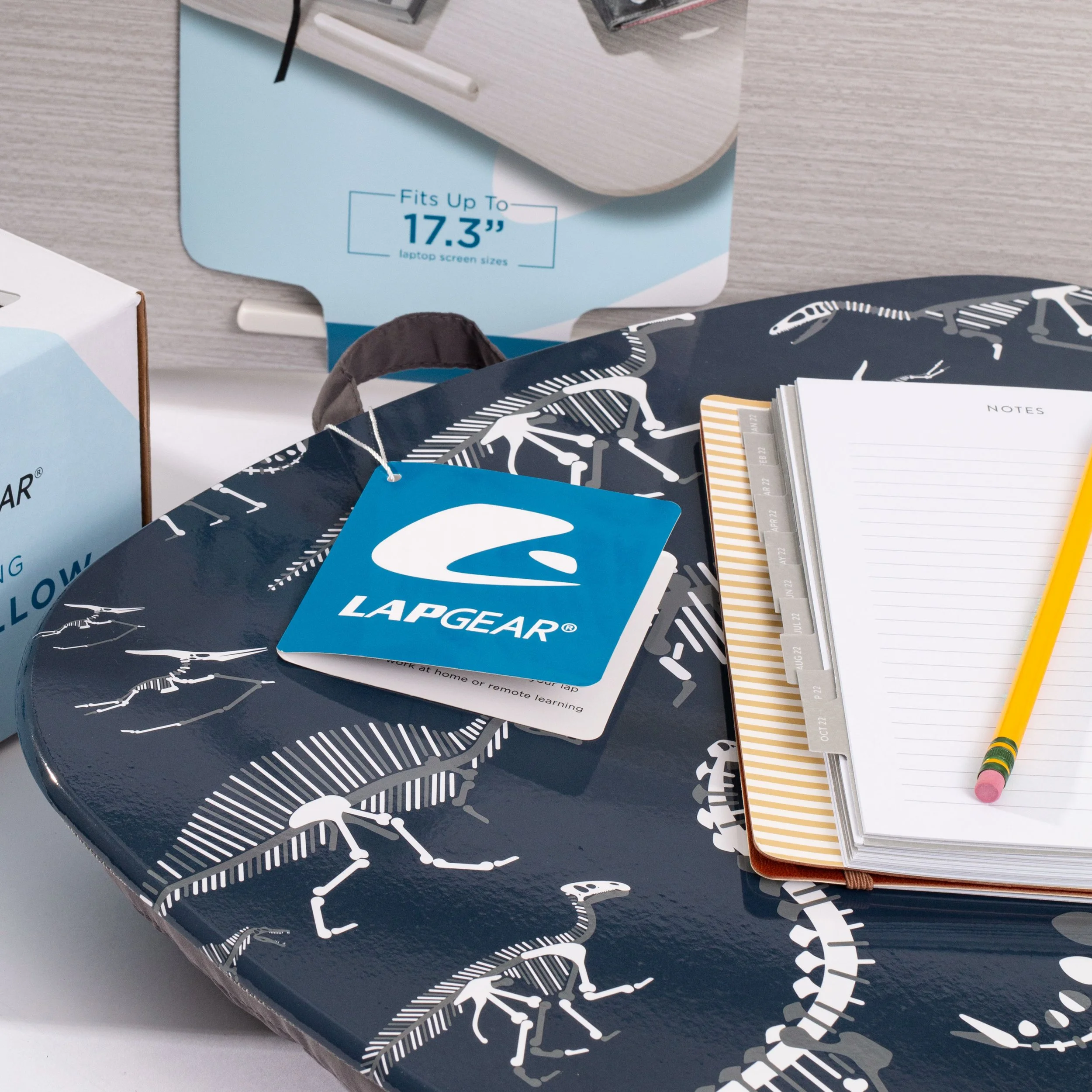
The Solution: Build a stronger brand identity
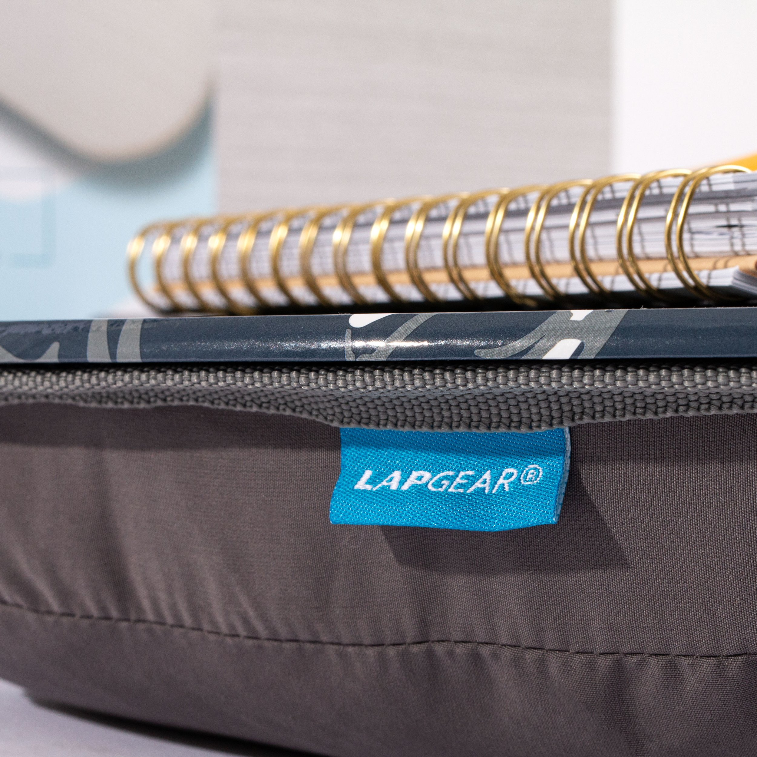
Front and center brand logo
Use the brand Pantone more effectively
Consistent typeface used across packaging
Visually connect LapGear® to lap desk
Develop an eCommerce website to build brand trust
Easy-to-scan QR codes to access brand information quicker
Content creation and management for social media


Updated Website!
The relaunch of the new site was designed to build brand trust, and improve customer experience with the brand by
Allowing customers to learn about LapGear® products and services with compelling visuals and clear insight.
Eliminate the chances of seeing competitor ads and products (as seen on Amazon).
In December 2021, a relaunch of the new and improved site went live. Within the first month, the site received a positive response.
2% Conversion Rate
&
$8.5k in Sales
within the first month.
SOCIAL MEDIA
Keeping all corners of the brand’s image in check including Instagram and Facebook. We created posts of behind-the-scenes, new product launches, sales, and real user images to show that this is a genuine brand made for genuine people.


